
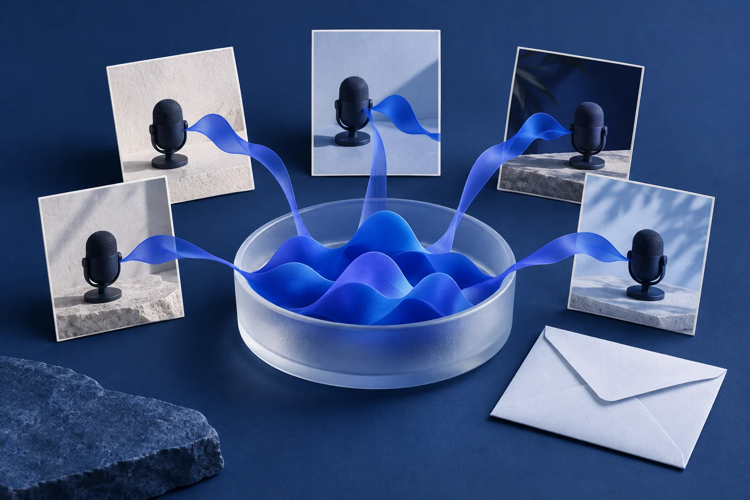
Create a product launch carousel that tells the viewer what is available, why it matters, and how to try it. Use the release brief to choose those points before writing slide copy. A launch sequence needs a clear offer, not a condensed history of the build.
Keep the announcement and access information together. A viewer who likes the first slide should not have to reach a landing page to discover that the product is invitation-only or that the feature is still a prototype.
Turn the release brief into a concrete opening
This worked example uses a fictional idea-capture app launching a shared inbox for voice notes. Suppose the hypothetical release is available to teams in an invitation-only pilot. These are illustrative script details, not facts about Prolifik or a real customer product.
The release brief might contain:
- Audience: small teams collecting ideas between meetings.
- New action: add a voice note to a shared idea inbox.
- Useful change: teammates can review the note in the same place.
- Access: invitation-only pilot, with a request page.
- Next step: request pilot access after viewing the workflow.
That gives the carousel an opening such as “Put the team's voice notes in one idea inbox.” A separate visible line can identify the pilot. Avoid “The future of teamwork has arrived,” which tells the audience little and consumes the space you need for the actual release.
Write the launch sequence before selecting images
Here is a five-scene fictional script:
| Scene | Draft copy | Visual role |
|---|---|---|
| Announcement | A shared inbox for the ideas you record between meetings | Establish the new product action |
| Situation | The useful note is on your phone. The next discussion is with the team. | Make the audience's context recognizable |
| Product | Add the voice note to the shared inbox for teammates to review | Explain the supported mechanism |
| Access | Invitation-only pilot for small teams | Keep the availability condition readable |
| Close | See the workflow and request pilot access | Give the matching next step |
Do not add automatic transcription, translation, or task assignment unless the real product includes them. The fictional sequence describes a shared voice-note inbox only. Extra features would require their own support in the actual brief.
Intercom's product announcement guidance discusses communicating updates to different audiences. Use that as a reason to write for the people who can use this release, rather than attempting to address every possible buyer in the same slides.
Choose images that make the release easier to understand
For the fictional voice-note app, use a phone-recording concept, an audio ribbon, and a shared collection. Keep the same audio object across the scenes so the viewer can follow its journey. A different abstract pattern on every slide would lose that connection.
Actual product footage or authorized screenshots can show the real shared inbox. Conceptual artwork can explain the idea without impersonating the interface. If the carousel uses illustrations, do not label them “app screenshots” or suggest they show a generated real product output.
A launch video should make the product recognizable, but recognition does not require a wall of tiny UI. The product video examples guide helps choose which parts need a demonstration and which can be explained visually.
Give the generated draft the release state
Use a creation brief that includes the offer and the access condition in plain language. For the example:
“Make a launch carousel for a fictional shared voice-note inbox. Audience: small teams collecting ideas between meetings. Explain the situation and one supported action. Clearly state invitation-only pilot before the close. Use simple cobalt audio and collection imagery. Do not add transcription, performance claims, or unavailable features.”
Adapt the brief to the actual release and use Prolifik's Image Carousel workflow. Choose the intended video render or supported image-slide publishing path. The creation format does not decide whether your product is publicly released.
Review the opener, access scene, and close as a group. If one says “try it today” and another says “request an invitation,” choose consistent wording. Keep the CTA destination aligned with what the viewer was offered.
Make the announcement complete at phone size
Play the draft without pausing. A launch scene often becomes crowded because teams add the brand name, feature name, audience, promise, date, and several qualifications at once. Spread those jobs across the sequence rather than shrinking all the words.
Keep the access condition with sufficient time and contrast to read it. Remove decorative movement if it distracts from the product action. Use the same presentation style for the availability line as for the rest of the launch information; it should not look like a hidden disclaimer.
After the relevant product is available, update the opening and access wording if the release state changes. The core story can remain the same while the next step changes from requesting access to trying the current workflow. Create the carousel around a concrete release people can understand, then finish with the action they can actually take.
Build the launch announcement carousel
Keep current availability in the opening and give the viewer a useful next action.
See Image CarouselProduct and primary-source checks: 12 October 2026. Examples are editorial working illustrations unless a real source is identified.
- Intercom: Scaling product announcements, audience-specific announcement reference.
- Prolifik Image Carousel, checked 12 October 2026.
- Canva Design School: Carousels worth swiping for, sequence reference checked 12 October 2026.