
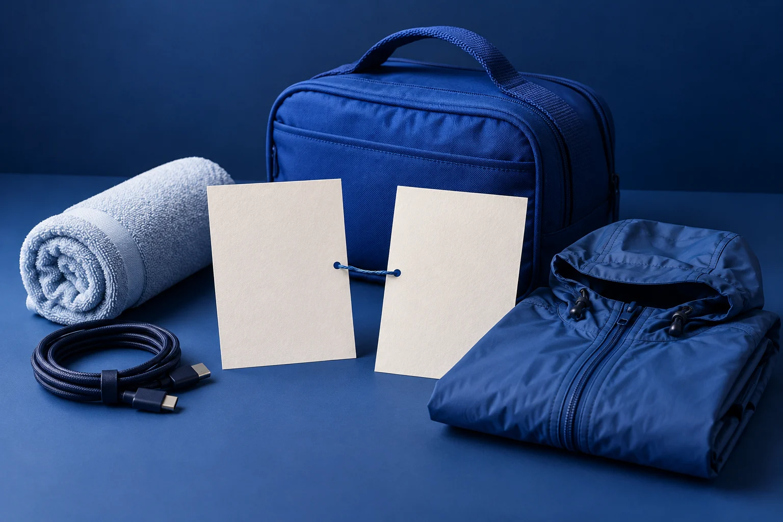
A product feature carousel should explain the change a user can make, then show enough of the mechanism to make it believable. Start with the job rather than a feature badge. “Reuse a packing list for the next trip” gives you a sequence; “Introducing reusable templates” gives you a label.
An image-led sequence works when you need to explain a feature before someone tries it. If the important point is where to tap or what the real screen displays, include suitable product imagery or use a recorded demonstration instead of inventing an interface.
Choose a feature with a useful before and after
This tutorial uses a fictional travel-packing app. Imagine its users can duplicate a saved packing list, then adjust it for a different trip. The plan below is original illustrative copy, not an actual generated Prolifik output or a result from a real app.
The starting problem is a traveler rebuilding the same basic list. The useful change is making a copy and adapting it. The carousel does not need to claim that the feature prevents forgotten items or saves a specific number of minutes.
List the objects you need to explain: original list, copied list, changed trip, and adjusted items. Those objects can carry the visual story without filling every scene with software controls.
Build the feature around five distinct scene roles
Use this worked script as an example:
| Role | Draft text | What the visual should explain |
|---|---|---|
| Problem | Your next trip needs a list. Most of the basics have not changed. | Two trips sharing a few physical packing items |
| Mechanism | Copy a saved list instead of starting empty. | One list producing a separate editable copy |
| Condition | Check the new trip before keeping every item. | A warm-weather object beside a cold-weather object |
| Example | Keep the charger. Replace the beach towel with a rain jacket. | The specific retained and changed objects |
| Next step | Make a trip-specific list from your saved starting point. | A finished collection suited to the new trip |
The condition belongs inside the explanation. It teaches the person to adapt the copy rather than assume a saved list fits every journey. The example turns a general feature into an action the viewer can picture.
Change the object and example for your actual product. A saved reply, recipe collection, or project template may use a similar copy-and-adjust mechanism, but the conditions differ. Write the scene that your product can support.
Keep the illustration and interface distinct
A conceptual illustration can show two lists and changing objects. It cannot prove the appearance of your app's duplicate control. If you need to show the interface, use an actual authorized capture of the current product and make the relevant detail readable.
Do not draw a convincing settings screen merely because the real screenshot looks busy. You can make the explanation cleaner by showing the concept, then giving the user a real demo or guide as the next step. The product video examples guide helps distinguish demonstrations from explanatory treatments.
For the fictional packing feature, physical objects would be enough to explain reuse. The copy can name the action without depicting a specific nonexistent button. That is why the visual brief matters as much as the slide words.
Give the creator a prompt with a mechanism
A useful creation prompt might say:
“Explain a fictional packing-list app's saved-list feature to occasional travelers. Show the problem, copying a list, checking the new trip, one concrete item swap, and the next step. Use a cobalt and navy visual family with simple packing objects. Do not invent UI, customer results, or time savings.”
This is a prompt template to adapt, not a claim that a supplied prompt produced the finished examples in this article. Add the actual product behavior and brand context before making your own draft.
Use Prolifik's Image Carousel format for the scene treatment, then check the intended output. A timed video render combines words, imagery, transitions, and audio; an image-slide publishing path is a different presentation. Review a video draft during playback. A slide that needs a long pause to decode may need fewer words or a simpler visual.
Make the feature legible through the sequence
Keep the reused object visually consistent. If the original list changes color, shape, and layout at every scene, the viewer has to work out whether it is still the same object. Change the part that explains the feature and retain the rest.
Watch with sound off to inspect the words and visual progression, then listen with sound on to check the combined pace. Look for duplicated information: if a clear item swap already communicates the example, the text does not need to describe every object again.
Finish with an action that follows the feature. A task guide or creation path is useful; a generic boast about the whole app interrupts the lesson. Use the rendered file to confirm that the useful change remains visible from problem to completion.
Create a carousel for one product feature
Give the useful change and its condition enough space to be understood.
See Image CarouselProduct and primary-source checks: 12 October 2026. Examples are editorial working illustrations unless a real source is identified.
- Prolifik Image Carousel, checked 12 October 2026.
- Canva Design School: Carousels worth swiping for, sequence reference checked 12 October 2026.
- Vimeo software video demos, real demonstration reference.