
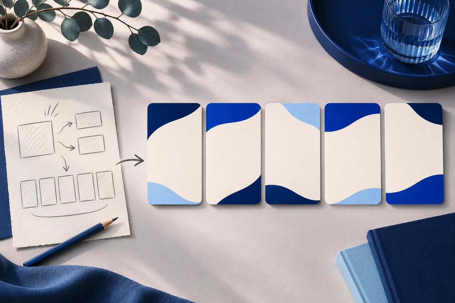
A sketch is an excellent way to discover the order of an idea. It is not a ready product screenshot. When you turn rough notes into a carousel, decide which marks represent an approved feature, which are merely questions and which details a reader needs on each card.
This is different from turning a polished blog post into slides. A sketch can contain unlabeled arrows, crossed-out options and proposed UI that never shipped. The editing job begins with interpretation, not layout.
Read the sketch as a decision record
Imagine a fictional project app called DraftPier. A founder's notebook shows three boxes: “request,” “review” and “publish.” A pencil arrow jumps from request to publish, while another route passes through review. A note in the margin says “maybe admin only.”
Do not put those boxes into a public carousel as though they were a current workflow. First ask the product owner which path exists in the live app, who can use it and whether an exception applies. The crossed-out route may show a discarded idea, not an alternative feature.
Keep a small interpretation sheet:
| Sketch element | Question before publication | Treatment |
|---|---|---|
| Solid box | Is this a real step or a placeholder? | Use only after current source confirms it. |
| Arrow | Does the app actually move the work this way? | Replace with a verified sequence. |
| Crossed-out branch | Was this removed or never built? | Keep out of a public feature claim. |
| Margin note | Is this a limitation or an open question? | Resolve with the owner; preserve the limitation. |
The sheet prevents a designer or image model from making an ambiguous pencil mark look like a precise product diagram.
Give each card one reader job
For a verified DraftPier review flow, an original five-card sequence might be:
- Cover: “What happens before a team post goes live?” This sets the question without claiming the app prevents every mistake.
- Request: show the source content and the person initiating a review.
- Reviewer: name the actual role that can approve or return the request.
- Decision: show the approved and returned states as separate possibilities.
- Next action: point to the current workflow or a real demonstration.
Card four matters because a linear sketch can make approval look inevitable. If the app permits returning a request, that branch belongs in the explanation. Do not shrink an exception into a footnote that disappears when the card is shared alone.
Canva's current carousel guidance emphasizes readable hierarchy and restrained slide content. That is useful design context, but it does not verify DraftPier's workflow. The source of truth is the product implementation and approved copy.
Decide what should remain literal
Exact role names, UI labels and dates need controlled text. Put them in an editable copy layer or real screenshot and proofread the exported card. Use conceptual artwork for the visual idea, not for a fake interface.
If the rough sketch includes a drawn button, decide whether the carousel needs a button at all. A generic rectangle can imply a real control. Better to show a neutral process card and link to the current product guide unless a verified screenshot is available.
Keep the first and last card aligned. A cover that promises “one click to approval” cannot be rescued by a later card explaining that review may take several steps. The takeaway must be honest at every point where a reader could stop or screenshot.
Use the generated carousel as a draft to inspect
Prolifik Image Carousel can turn an approved prompt or product URL into a branded carousel-style video. Provide the verified sequence and prohibited claims in the brief. A tool may still change a role label, skip a branch or make a visual transition that suggests the wrong order. Inspect every returned panel and the timed video separately.
The blog-post-to-carousel guide starts from edited prose. Here the source is an ambiguous drawing, so keep the interpretation sheet beside the output. If the tool renders only the neat boxes but loses the exception, revise the approved text or choose a more controlled design workflow.
Do not confuse a visually clean draft with a complete product review. Ask the owner of the actual process to sign off on the final card sequence, labels and CTA. If a feature changes during production, update the source note before generating more variations.
Check the carousel in the form people will see
Look at each card at phone size. Can the reader identify the current state without remembering the previous card? Does the arrow point the right way? Are source notes or limits readable? A card that only works when someone explains the sketch in a meeting is not finished.
Then watch the timed export. A transition can animate a branch away before it can be read. Give the result and the returned path enough time. If the carousel will be posted as still images too, verify that the standalone images have the same current wording.
Retain the original sketch privately, the owner-approved interpretation, the exact copy and the final exports. The rough drawing remains useful as a thinking tool without becoming fabricated evidence of the product.
Turn approved steps into a branded carousel
Give the format checked copy and inspect every returned panel and timed export.
Explore Image CarouselFacts checked 2026-11-02. Worked examples are illustrative unless a real source is identified.
- Canva: how to create instagram carousels worth swiping for Checked 2026-11-02
- Prolifik: image carousel Checked 2026-11-02